Stippling of 2D Scalar Fields
Johannes Eschner
Tobias Ruttner
About
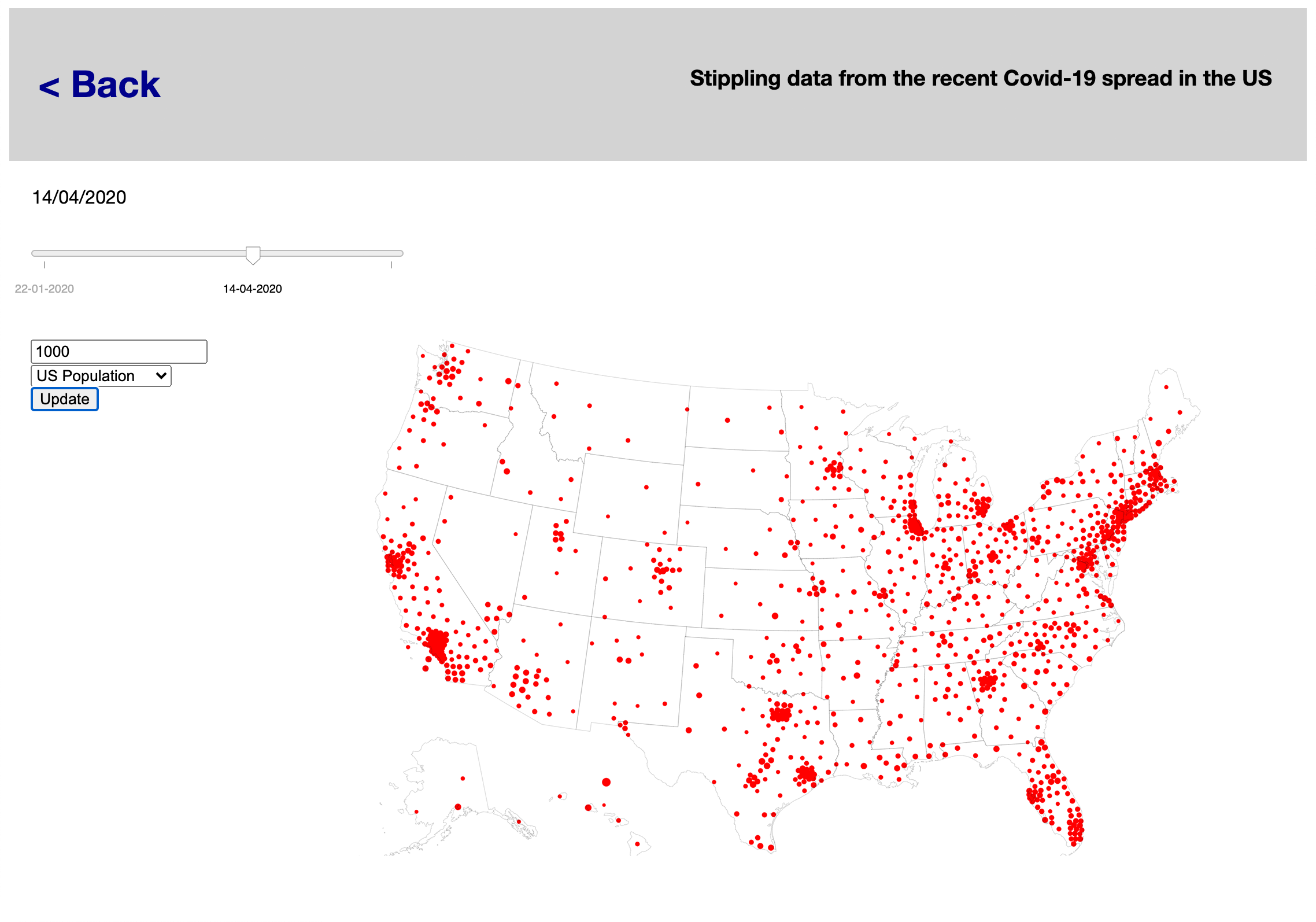
In this project an implementation of the modified LBG Stippling algorithm from Goertler et al. is used to visualize several different datasets. The first dataset contains information on the spread of Covid-19 in the US. Here stippling is used to represent the relative densitiy of case numbers throughout the US. The second dataset is a height map, where stipple densities are used to represent the height values for a more intuitive visual representation. The third dataset is a test dataset of a linear gradient that was added to intuitively showcase the power of the stippling algorithm.
One of the main findings of this project was that the stippling approach is not equally effective for all kinds of data. In case of the Covid-19 cases the per-county availabiliy of the data made it quite difficult to create meaningful stippling results when the data was sparse.
To view and interact with a dataset click on the respective card above.Usage
When entering the application three different samples are provided. Each sample loads on the initialization of the page and displays the stippled representaion of the respective dataset automatically.Interaction
On the height map and the gradient the user can change the initial number of stipples with which the algorithm is initiated. For the Covid-19 data the user can choose between three different datasets (population density, Covid-19 cases nd Covid-19 deaths) additionally the date for which the data should be displayed can be selected. When clicking the "Update" button the stippling representation is updated accordingly.Program
- The program can be accessed here: Program
- The code documentation can be found in the following directory: Documentation
- The source code can be can be accessed here: Source Code